GLORIAH

BRIEF - Design a luxurious, disruptive and 70’s styled visual identity and website for the sexual wellness company GLORIAH.


CHALLENGE - GLORIAH was founded to promote sexual wellness for women through products and community. The founders were tired of the same monotonous sex brands, and looked to create a high-end brand with a difference. The 70’s feel of the brand not only sets them apart from the current market leaders but also acts as an ode to the time of the ‘second wave’ of modern feminism.
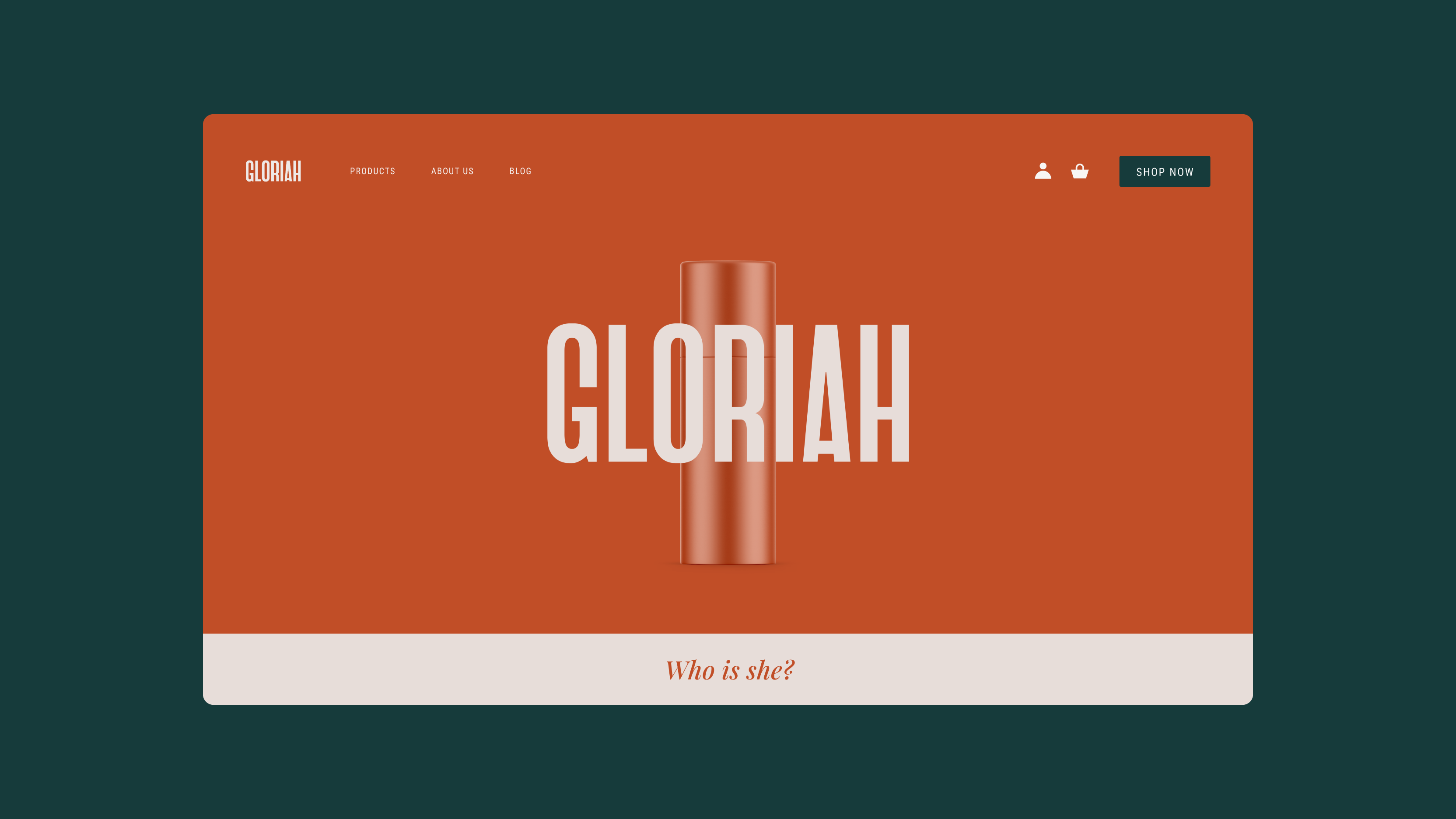
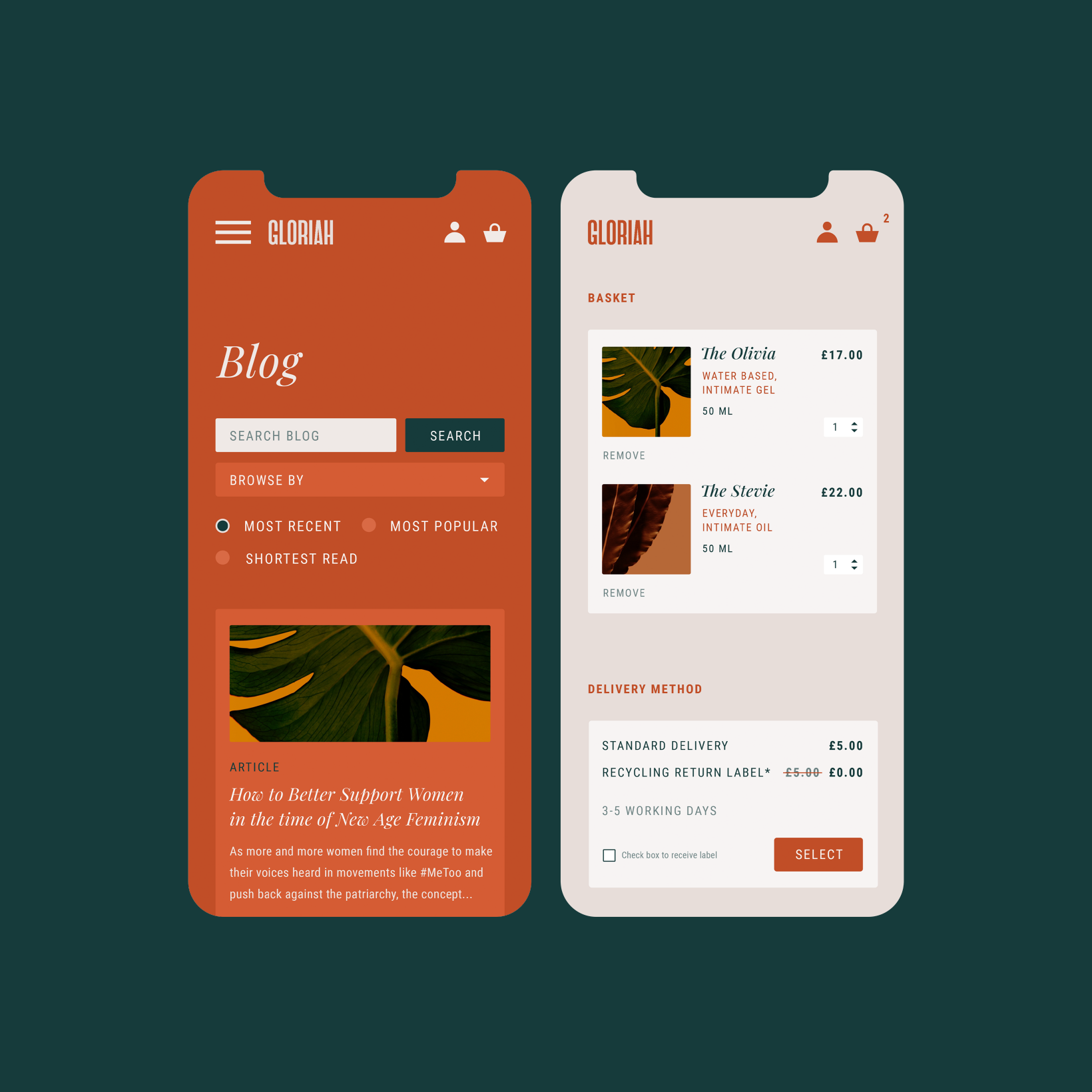
In contrast to the disruptive branding, the website needed to follow the same paths as other product websites to enhance ease of navigation and reduce the time to purchase. Additional measures including minimal checkout steps, high contrast buttons and large font size were put in place to make all users across the board feel at ease when using the site.


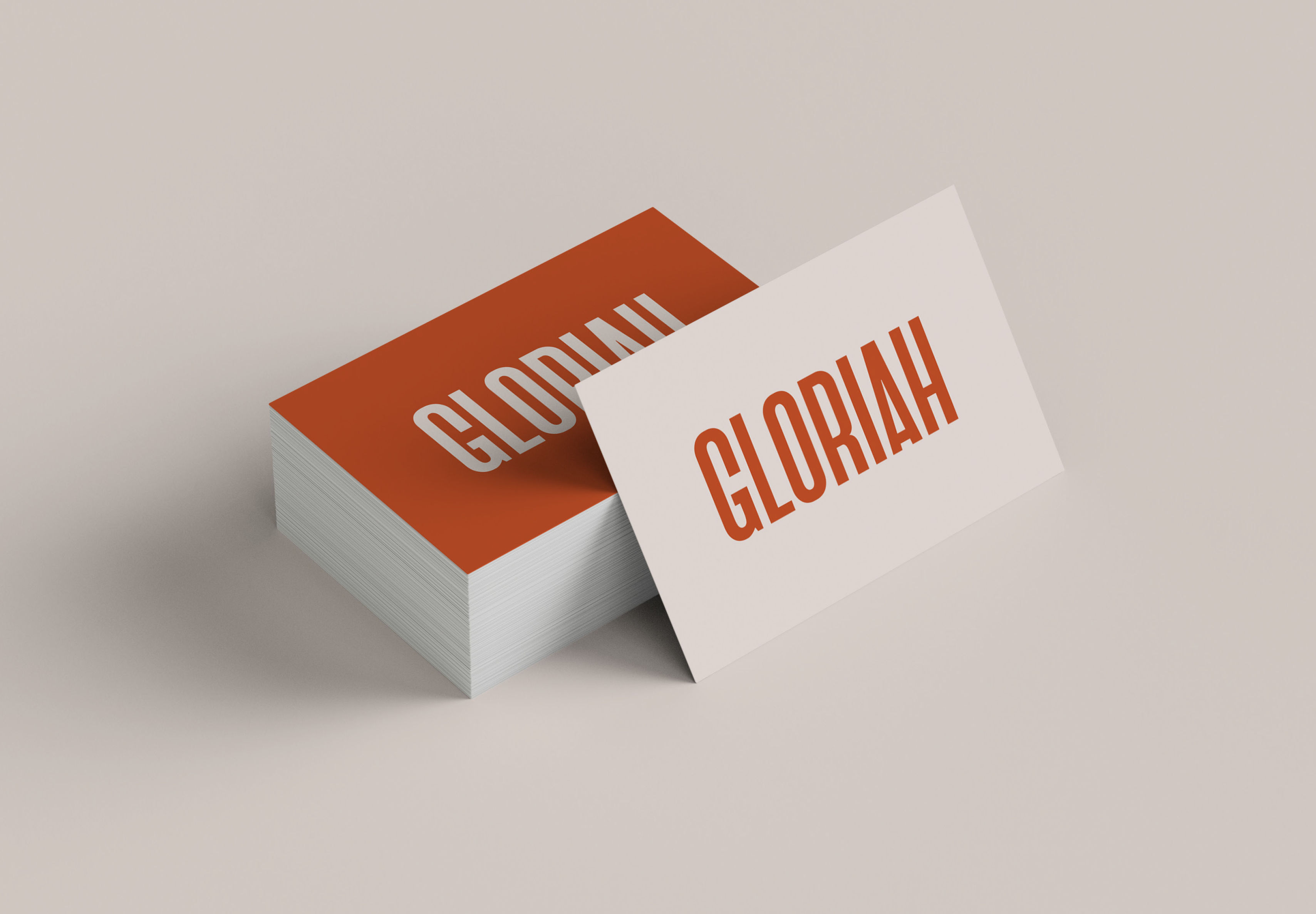
SOLUTION - The elongated lettering and warm shades of terracotta deliver a visual identity that marries together elegance and a retro aesthetic. Overall, a disruptive and elegant brand was created to target a stale market whilst still employing UX/UI industry standards to ease the customer experience at the point of purchase.
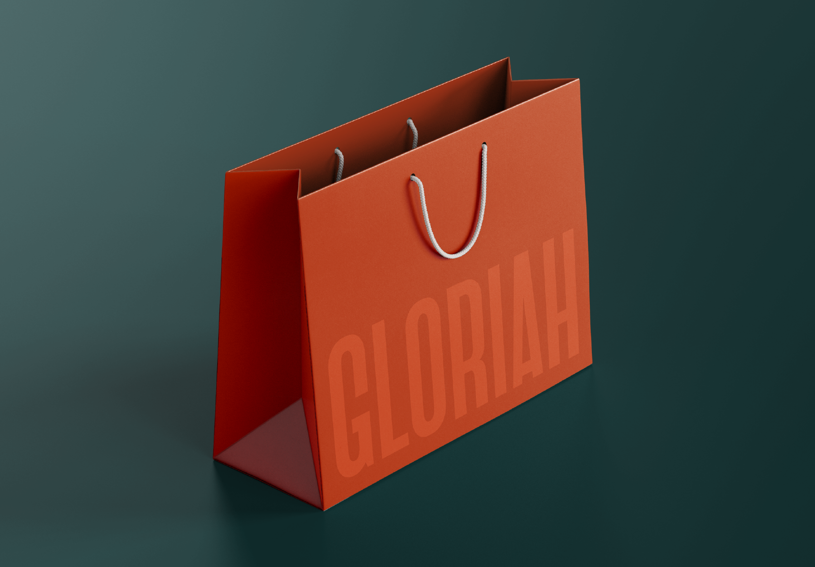
Packaging coming soon.


The 70’s feel of the brand not only sets them apart from the current market leaders but also acts as an ode to the time of the ‘second wave’ of modern feminism.
In contrast to the disruptive branding, the website needed to follow the same paths as other product websites to enhance ease of navigation and reduce the time to purchase. Additional measures including minimal checkout steps, high contrast buttons and large font size were put in place to make all users across the board feel at ease when using the site.
GLORIAH
BRIEF - Design a luxurious, disruptive and 70’s styled visual identity and website for the sexual wellness company GLORIAH.
CHALLENGE - GLORIAH was founded to promote sexual wellness for women through products and community. The founders were tired of the same monotonous sex brands, and looked to create a high-end brand with a difference.
SOLUTION - The elongated lettering and warm shades of terracotta deliver a visual identity that marries together elegance and a retro aesthetic. Overall, a disruptive and elegant brand was created to target a stale market whilst still employing UX/UI industry standards to ease the customer experience at the point of purchase.


GLORIAH

BRIEF - Design a luxurious, disruptive and 70’s styled visual identity and website for the sexual wellness company GLORIAH.


CHALLENGE - GLORIAH was founded to promote sexual wellness for women through products and community. The founders were tired of the same monotonous sex brands, and looked to create a high-end brand with a difference. The 70’s feel of the brand not only sets them apart from the current market leaders but also acts as an ode to the time of the ‘second wave’ of modern feminism.
In contrast to the disruptive branding, the website needed to follow the same paths as other product websites to enhance ease of navigation and reduce the time to purchase. Additional measures including minimal checkout steps, high contrast buttons and large font size were put in place to make all users across the board feel at ease when using the site.


SOLUTION - The elongated lettering and warm shades of terracotta deliver a visual identity that marries together elegance and a retro aesthetic. Overall, a disruptive and elegant brand was created to target a stale market whilst still employing UX/UI industry standards to ease the customer experience at the point of purchase.
Packaging coming soon.
